
Announcing our new logo and look!
Big news! Today, following 4 years, we’re releasing a refreshed brand character, which incorporates a new logo, hues, and textual style. You’ll see the new look anywhere we’re out in the open, similar to our website, Facebook, LinkedIn and Twitter. We trust the new look better matches what we’ve moved toward becoming since 2013: a provider of insightful innovation that modernizes parts of the work of Information & Technology, while better interfacing researchers to each other and their foundations.
Since our establishing in 2013, we’ve pretty much stayed with a similar turning particle logo, albeit as of late we’ve somewhat modified our colors—you can’t generally censure us, they were dark colored and orange. Be that as it may, over the most recent couple of years we’ve changed a considerable amount: we propelled other services that may help our clients making their brand more aware. The old look began to scrape. The particle felt somewhat logical (we serve all controls, all things considered).
Our design goal was to better match how we look to our values and the users we serve. A small team inside the company worked to find something that appeared crisp, approachable, smart, friendly, and connected.
Compared with red, the lighter orange is cool and refreshing, and the darker, black-gray feels a bit collegiate. The font is deliberately clean, modern, and light.
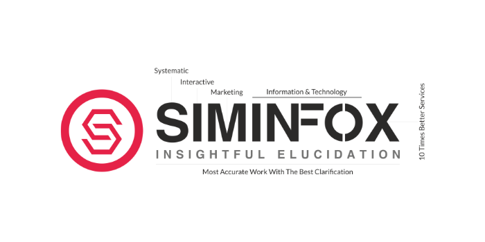
The logo, quite obviously, represents the company name, but it’s stylized with straight alignment to appear friendly, and even slightly clean. Our decision to use a tag line in the logo was inspired by various IT Brands, which always gives their best so we have decided to keep it as “INSIGHTFUL ELUCIDATION”.
We hope you like this new look and feel for SIMINFOX! Look out for more updates—like an updated look in our services and a brand-new website—as we continue to try to better serve our users in all the sectors with clean, modern, user-friendly technology.